
In general, the action interface looks like this:
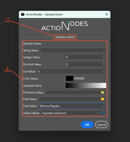
Where:
- The name of the action, if specified.
- A list of defined action parameters.
Parameters Panel #
To create an action interface, you need to use input parameters. You can configure the list of these parameters in the Parameters panel of the ActionNodes Editor’s side panel when creating or editing an action.

The panel contains a toolbar at the top with two buttons: Add parameter to add a new parameter to the parameter list and Clear to remove all parameters from the list. The rest of the panel contains a list of parameters.
When added, the new parameter appears at the end of the list. The order of the parameters in the list corresponds to the order in which the controls are displayed in the graphical interface of the action. You can change the order of the items in the list by simply dragging them with the mouse to the desired location.
Parameter Item Structure #
In general, each element in the parameter list consists of a header and a body.

- The header consists of a text label (name) and controls for this item:
- An icon that indicates the type of parameter.
- Parameter caption. It consists of the label value (or identifier if no label is specified) and the parameter type specified in brackets.
- Button for duplicating the parameter. A copy of the variable (with only a changed name) is inserted immediately below this variable in the list.
- Button to remove the parameter from the list.
- The body of a parameter consists of many elements, the number of which differs depending on the selected parameter type. But there are a certain number of items that are common to all parameters, regardless of their type:
- Identifier. The unique name of the parameter that is accessed from the action algorithm. It is required to be defined. Valid characters for the identifier: uppercase and lowercase Latin characters, numbers, and the “_” character.
- Label. A text label that is displayed to the left of the control in the GUI of the action. It is optional. If not specified, the identifier is displayed as a label.
- Tooltip. A tooltip for a parameter. Displays as a standard tooltip when you hover over the controls of an action parameter in the action GUI. If necessary, type here additional information for the user of your action. Optional.
- Checkable. Sets the ability to check a parameter in the action’s GUI. If this option is checked, a checkbox appears to the left of this parameter in the action’s GUI. If it is unchecked, the controls for this parameter become disabled, and if it is checked, they become enabled.
- Checked by default. This option is available only if the Checkable option (4) is turned on. Sets the default value for the Checkable parameter.
- Type. Sets the type (and editor) of the parameter. To get the value of any parameter inside an action, you need to know what type it is (as well as its name) and use the Get Value node.
- All elements in this area after the Editor element set the settings for the editor for the specified type. The number of these elements and their type varies depending on the specified editor.
Settings for parameter editors #
Depending on the specified parameter type editor, the list of elements in the parameter body that define its settings changes.
Action Type #
Actions Combo Box Editor #

Editor for Action type. To get the value of this parameter, use the Get Action Value node by selecting the item in the Value Type property that corresponds to the identifier of this parameter.
For this editor, you can only set a default value – the Photoshop action that initializes the editor (a combo box with a list of available Photoshop actions).
Boolean Type #
Checkbox Editor #

This parameter returns a Boolean value. To get the value of this parameter, use the Get Boolean Value node by selecting the item in the Value Type property that corresponds to the identifier of this parameter.
For this editor, you can only set a default value to initialize the editor (check box).
Color Type #
Color Selector Editor #

Editor for Color type. To get the value of this parameter, use the Get Color Value node by selecting the item in the Value Type property that corresponds to the identifier of this parameter.
For this editor, you can only set a default value, which is the color that initializes the editor.
Decimal Type #
Decimal Spin Box Editor #

Editor for Decimal type. To get the value of this parameter, use the Get Decimal Value node by selecting the item in the Value Type property that corresponds to the identifier of this parameter.
The settings for this editor are quite similar to those for the Integer spin box editor:
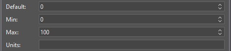
- Default. This is a fractional value that will be used to initialize the editor for this parameter.
- Min. Sets the minimum allowed fractional value that can be set in the action GUI editor for this parameter.
- Max. Sets the maximum allowed fractional value that can be set in the action GUI editor for this parameter.
- Step. Specifies the step to change the value when clicking on the up and down buttons of the editor in the action GUI for this parameter.
- Units. Sets the visual hint for the units of measurement that appear to the right of the value in the editor in the action GUI for this parameter. Does not affect the operation of the parameter.
Gradient Type #
Gradient Box Editor #

Editor for Gradient type. To get the value of this parameter, use the Get Gradient Value node by selecting the item in the Value Type property that corresponds to the identifier of this parameter.
For this editor, you can only set a default value, which is the gradient that initializes the editor.
Integer Type #
Integer Spin Box Editor #
Editor for Integer type. To get the value of this parameter, use the Get Integer Value node by selecting the item in the Value Type property that corresponds to the identifier of this parameter.
For an editor of this type, you can specify the following settings:
- Default. This is an integer value that will be used to initialize the editor for this parameter.
- Min. This is the minimum value that is valid for this parameter. You will not be able to set a value less than this in the editor for this parameter.
- Max. This is the maximum value that is allowed for this parameter. You will not be able to set more than this value in the editor for this parameter.
- Units. Sets the units of measurement for the parameter. Does not affect the operation of the editor, only adds a visual hint to the user about the units of measurement for the parameter in the form of a text label on the right side of the parameter editor.
Combo Box Editor #

Editor for Integer type. To get the value of this parameter, use the Get Integer Value node by selecting the item in the Value Type property that corresponds to the identifier of this parameter.
The setting shown in the image above will create the following combo box:

Each setting item has the following structure:
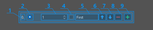
- Item number.
- Radio button to set the default (selected) item for the combo box.
- The number to which this item corresponds. It is returned as the value of this parameter if this item was selected in the combo box.
- Separator check box. If this check box is checked, this item is a separator. The separator is displayed as a horizontal line in the combo box, cannot be selected, and is mainly used as a visual separator of items into groups. Since the separator is not selectable, it cannot be assigned a number to return the result. Also, checking this checkbox will not work if the current item is the last item in the list that is not a separator.
- The text label for the current item in the combo box.
- Button to move the item up the list.
- Button to move the item down the list.
- Button to remove an item from the list. It does not work if you try to remove the last item from the list that is not a separator.
- Button to insert a new item after the current item.
Search Type #
Search Editor #
No settings for this parameter type
String Type #
Text Box Editor #

Editor for String type. To get the value of this parameter, use the Get String Value node by selecting the item in the Value Type property that corresponds to the identifier of this parameter.
For this editor, you can only set a default value, which is the string that initializes the editor (an input field).
Filename Text Box Editor #
Editor for String type. To get the value of this parameter, use the Get String Value node by selecting the item in the Value Type property that corresponds to the identifier of this parameter.
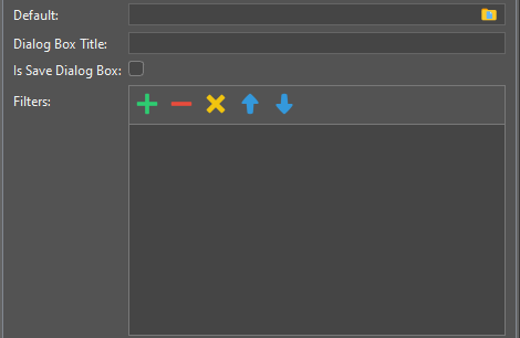
The editor is an input field with the ability to specify a file through a standard file selection dialog. You can set the following settings for this editor:
- Default. The default value (full file name) that initializes the editor.
- Dialog Box Title. The title of the file selection dialog box that opens when you click the corresponding button on the right side of the editor.
- Is Save Dialog Box. If the checkbox is checked, the dialog box allows you to specify a name for a file that doesn’t exist – this is usually available in file-saving dialog boxes. If the checkbox is unchecked, only an existing file can be selected in the file selection dialog.
- Filters. Specifies a list of filters for file names used in the file selection dialog box. If you want to specify a description for a filter, type it, and then type the filter itself in parentheses, for example, Text Files (*.txt). Then only the text in the parentheses will be used as a filter. If you want to specify several filter options for one element, just write down the filters separated by spaces, for example, JPEG Files (*.jpeg *.jpg).
Font Combo Box Editor #

Editor for String type. This parameter returns a string value (the selected font name in the fonts list). To get the value of this parameter, use the Get String Value node by selecting the item in the Value Type property that corresponds to the identifier of this parameter. To get information about the selected font, use the Get Font Name, Get Font Family Name, and Get Font Style Name nodes to which you need to pass the index of the selected font in the font list, which can be obtained from the Find Font By Name node by passing it the string value from this parameter.
For this editor, you can only set a default value, which is the font name that initializes the editor (a combo box with a list of fonts available in Photoshop).
Path Name Text Box Editor #

Editor for String type. To get the value of this parameter, use the Get String Value node by selecting the item in the Value Type property that corresponds to the identifier of this parameter.
The editor for this parameter is an input field with the ability to specify a folder using the standard folder selection dialog. For this editor, you can specify the following settings:
- Default. A default value (folder path) that initializes the editor.
- Dialog Box Title. The title of the folder selection dialog box.


